What is Grey Zone Advertising?

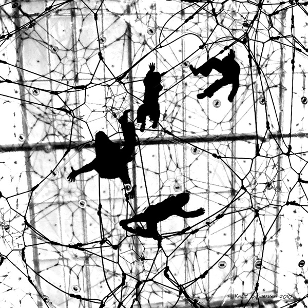
The Cure.

The Cure. Copyright 2010: Knut Skjærven.

Let’s continue the talk about advertising.

Advertising, as defined here, is a special branch of communication and not something different from it. Advertising can, and should, be treated with the barebones resources made available on this blog.

So, that is just what I will continue to do. I will also move back to the Danish telco project for this particular blog post.

The three companies I am investigating are TDC, Telenor and Telia. Why address telcos, you may ask? The answers to this question are simple. Here are a two of them: The area is highly prolific, and intensely competitive. That goes particularly for the Danish market since it is considered pretty mature and a rather small one.  The three main companies mentioned are sweating for arguments to increase and/or to protect market shares.

Follow this link for more good reasons.

You may remember that I some time ago lay the foundation for a backbones bases view on advertising. I talked about Red Zone, Blue Zone and Grey Zone Advertising.

In this post will I will ask the question: What is Grey Zone Advertising? And I will try to answer it. At least indicate an answer.

I have suggested that we split advertising three ways: First there is Red Zone Advertising (Above the Line Advertising), secondly there is Blue Zone Advertising (Below the Line Advertising) and then barebones introduces a third form of advertising Grey Zone Advertising (Beyond the Lines Advertising).

These three forms exhausts the area. All company activities, in any form whatsoever, are activities within one or more of the three zones mentioned.

The first two zones are familiar to most dealing with advertising, but the third one is not. Normally activities that you find in the Grey Zone area would not be considered advertising at all. But it needs to be accepted as advertising as it is a type of activity that promotes services and products for a company just as strongly as Red Zone and Blue Zone Advertising do. In some cases Grey Zone messages may even contradict and overrule what is stated in Red and Blue Zone messages.

Let’s take the case of TDC CEO, Henrik Poulsen, who apparently acts as a Light Master in one of the company commercials from late 2009.(See this post). The commercial operates in two zones: The first zone is Red Zone. The  second zone is Grey Zone. Let me explain: It operates in Red Zone since it obviously is a commercial for a specific TDC services. In addition it operates in Grey Zone  since CEO, Henrik Poulsen, has chosen to cast himself as the Light Master standing on top of a ladder in the opening scene of the commercial. Casting himself in that role effects the basic message of the particular TDC service. The effect could be good for business, it could be neutral for business or it could be bad for business.

Let me take this a step further: If Henrik Poulsen is a person well perceived by the audience his appearance in the commercial may be taken as a sign of courage, playfulness, and youth and thereby effect the TDC service positively. On the other hand, if Henrik Poulsen is not well perceived his appearance might effect sales and image negatively.

Most likely the result here is zero since none would ever suspect the head of a company the size of Danish TDC to act as Light Master in one of his own commercial. And the scene is very brief, indeed. Could be that Henrik Poulsen will simply not be recognized as the CEO of one of the largest Danish companies: TDC.

You have ONE question. I sense that. Why do I want to call Grey Zone Advertising for advertising at all when it is not generally recognized  as such? And what a good question that is. Once again the answer is simple: If you don’t label it as advertising you will tend to overlook the fact that is works like advertising for the company, their products and services. That’s why. You will most likely work out of focus, blindly. If that’s what you intend feel free to pick another name for it :-). Many do.

By the way: What on earth is Henrik Poulsen doing on top of that ladder in the first place?

All for now. Have a good weekend . TGIF.
……………………..

For more posts in the telco project, visit telco basecamp.

Share On Facebook

Walk of Life

Walk of Life. Copyright 2010: Knut Skjærven.

Walk of Life. Copyright 2010: Knut Skjærven.

Shot at National Gallery of Denmark. A wonderful place to combine art and people. The sculpture and the painting are both done by Danish artist Kurt Trampedach. Clearly “the pose” of this image is what gives meaning. And then we are, once again, being reminded of the powers of connotations.

Share On Facebook

Welles, Hitchcock, Poulsen or None?

It does not have to be that serious all the time. So here is a quiz. In fact, the first barebones quiz ever.

Question: Who is the Light Master on top of the ladder in this 2009 commercial from Danish telco TDC?

1. Is it Orson Welles, who often casted himself in his own movies? Remember Citizen Kane – the best movie ever made?

2. Is it Alfred Hitchcock, who made it his trade mark always to take a minor role in his movies?

3. Or is it simply the young CEO of TDC, Henrik Poulsen, taking time out to entertain the film crew and casting himself as a Light Master in this commercial from late 2009.

4. Sorry, none of the mentioned persons fit. It is someone else.

Let’s have your barebones vote below :-).


For more on barebones telco project, please go here.

Who Is Reading Barebones?

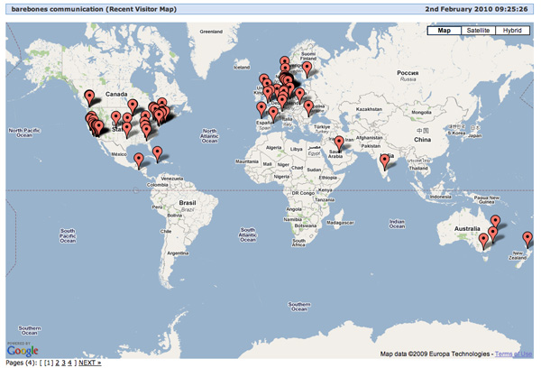
Screen shot 2010-02-02 at 09.24.56

Screen shot 2010-02-02 at 09.24.56

It has been a while since we had blog statistics. This time is as good as any.

Screen shot 300 2010-02-02 at 09.25.47

Who is reading barebones? The answer to that question is that I don’t know. But I have an idea of where they come from. Normally the US is in for 40plus percent of readership, but that changed overnight due to the last post in the TDC/Telia/Telenor Project. Even Norway and Sweden opted in with some readers. A few.

Americans, this morning, is down to 36,20 percent, the Danes (nudes included) up to 17,40 percent and the British try to hang in there as well with some 13 percent straight. Apart from the cold weather it is a good day.

Good to see that things work. They don’t always do.

By the way, I saw Telenor’s new commercial yesterday. I will comment on it soon. They give away mobile broadband access for free. Really, I should consider becoming a customer :-).

Both screenshots are from Statcounter.

Szarkowski: The Detail.

Lady in Red.

Lady in Red. Copyright 2007: Knut Skjærven.

“Once he left the studio, it was impossible for the photographer to copy the painters’ schemata. He could not stage-manage the battle, like Uccello or Velásquez, bringing together elements which had been separate in space and time, nor could he rearrange the parts of his picture to construct a design that pleased him better.

From the reality before him he could only choose that part that seemed relevant and consistent, and what would fill his plate. If he could not show the battle, explain its purpose and its strategy, or distinguish its heroes from its villains, he could show what was too ordinary to paint: the empty road  scattered with cannon balls, the mud encrusted on the caisson’s wheels, the anonymous faces, the single broken figure by the wall.

Intuitively, he sought and found the significant detail. His work, incapable of narrative, turned toward symbol.”

John Szarkowski: The Photographers Eye, The Museum of Modern Art, New York 2009.

Library Thing.

This is a barebones pitstop post. For more pitstop posts, please go to pitstop puzzle.

Other posts on Szarkowski: Introduction, The Thing Itself, The DetailThe FrameTimeVantage Point.

Szarkowski: Time.

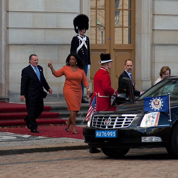
Oprah in Copenhagen. Copyright 2010: Knut Skjærven.

Oprah Winfrey in Copenhagen. Copyright 2010: Knut Skjærven.

“Photographs stand in special relation to time, for they describe only the present.

Exposures were long in early photography. If the subjects moved, its multiple image described also a space-time dimension. Perhaps it was such accidents that suggested the photographic study of the process of movement, and later, of the virtual forms produced by the continuity of movement in time.

Photographers found an inexhaustible subject in the isolation of a single segment of time. They photographed the horse in midstride, the fugitive expressions of the human face, the gestures of the hand and body, the bat meeting the ball, the milk drop splashing in the saucer of milk.

More subtle was the discovery of that segment of time that Cartier-Bresson called the decisive moment: decisive not because of the exterior event (the bat meeting the ball) but because in that moment the flux of changing forms and patterns was sensed to have achieved balance and clarity and order – because the image became, for an instant, a picture.”

John Szarkowski: The Photographers Eye, The Museum of Modern Art, New York 2009.

Library Thing.

This is a barebones pitstop post. For more pitstop posts, please go to pitstop puzzle.

Other posts on Szarkowski: Introduction, The Thing Itself, The Detail, The Frame, TimeVantage Point.

barebones’ new grasp on advertising

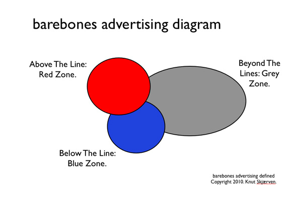
barebones advertising diagram. Copyright 2010: Knut Skjærven.

barebones advertising diagram. Copyright 2010: Knut Skjærven.

Please read this carefully. This is important information for grasping barebones’ ideas on advertising.

The three zones of adverting

What you see above is the newly conceived barebones advertising diagram. It is an illustration of how barebones sees, and defines, the main zones of advertising. How it sees advertising.

There is no part of advertising that falls outside the three zones. The definition is meant to be exhaustive. This means that there are three zones, and only three zones, of advertising, and that every gesture to advertise to a marked will fall in one or more of the three categories.

One thing is important: when you read the diagram you should read what you actually see:  1) There are no straight lines in the diagram, only curves. 2) The zones are all overlapping. Zones are fluent and they are all overlapping.

From here on we will talk about red zone advertising (above the line), blue zone advertising (below the line) and grey zone advertising (beyond the lines).

I am sure that you are already familiar with variations of the first two zones. And you probably already have an idea of the third zone, as well.

The parts of advertising

For barebones, however,  it is not just a questions of mapping advertising in three zones. There is a bit more to it than that. With the zones comes the question of interconnectedness and constitution.  Here is one thing you should remember: the zones of barebones advertising don’t stand together as pieces belonging to each other, they stand together as moments constituting each other.

This is an alternative way of dealing with advertising. Based on barebones resources we have simply dealt the cards anew.

The distinction between pieces and moments is a phenomenological theme. Roughly speaking pieces are parts that can be separated from each other, and in themselves constitute new independent parts. Like a branch that is cut from a tree and constitutes a new and separate unit (that again can be split into smaller parts). Pieces are independent parts.

Moments, however, you cannot take apart in the same way. Colour, for instance, is a moment and it can not be separated from that which it is colour of. The colour of the wall can not be separated from its extension. Every time there is colour there is extension. Colour can not be separated from its extension like a branch can be cut from a tree. Moments are nonindependent parts.

Important  implications

Here are the implications for advertising: The red zone, the blue zone and the grey zone of advertising are not related to each other as independent parts constituting the advertising message. Each zone does not potentially constitute pieces of the message. The zones constitutes potential moments of the message.

Following this line of thought the implication for advertising is severe. Both in the way you theoretically may want to look at advertising in the future, but most importantly for your understanding of message content (and form) in real advertising.

Messages are constituted by moments. That goes for advertising messages as well.

There will be much more about this in forthcoming posts. Let’s leave it here to take a quick look at what the red, the blue end the gray zones of advertising covers.

Red Zone Advertising/Above the Line

Red zone  advertising is mass communication. Commercials, print ads, posters, brochures. You know the lot. To  get attention for your mass communication, you need to break through the barrier of contextual noise.

The colour of attention is red.

Given the right position red zone advertising is for everyone to see, to explore and to react to. By the right positions is meant e.g. that you need to be in New York to be exposed to a New Your poster. You need to have the newspaper, the periodical, the television set tuned into the right channel, to be exposed to the ad, poster of commercial placed in that medium.

Blue Zone Advertising/ Below the Line

Blue zone advertising is not mass communication. It is selective and directed at you personally. Goes often by the name of  direct communication. Reaches you with the post, is  given over the phone, is displayed at your favorite web site. It is handed out to you by the sales person. Could come as a mail to you inbox as well. You know the lot.

This form of advertising is blue zone advertising because it is, or should be, so well controlled, or targeted, that is reached you and grabs your interest by the share being there. It is precise communication.

The colour of precision, is blue.

Grey  Zone Advertising/ Beyond the Lines

Grey zone advertising is traditionally not reckoned as adverting at all. On barebones communication it points to all other types of communication that reaches out from a person, a product or a company and thereby influences the chain of events that makes up the brand of a particular substance.

The reason why barebones stress and rephrase this type of communication (as advertising) is that, whatever you say, this zone of communication has an advertising effect. It pushes your attitudes towards a person, a company, a product or a service. It stimulates or it blocks business. And stimulation, in a broad sense, is what advertising is all about.

This however is not always recognized, but there seems to be an increasing awareness of this fact. At least the area is obscure as to what grey zone activity does in terms of image and of selling products and services.

The colour of obscurity is grey.

More to come

Let’s leave it here for the moment. What you need to remember from this post are the three zones of advertising, and that messages are constituted my moments.

Stay tuned.

Problems for Commercial Nudes: Claus and Britta.

It seems that Danish telco and advertising big spender, TDC,  has run into problems with their celebrated commercials featuring two middle age nudes, Claus and Britta. The two average Danes are played by Danish actors Kirsten Lehfeldt and Peter Frödin.

In a note posted at the fan site on Facebook , TDC ‘s site administrator, Jesper Ammitzbøll, says that he is no longer allowed to post the commercials on YouTube. He has taken all commercials off Facebook as well, not risking that the fan site is closed down. Jesper Ammitzbøll is working hard to find another solution, he says in his Facebook note Friday. The Facebook fan club at that time reaching close to 25.000 campaign enthusiasts.

Luckily, the embedded commercials on barebones communication are still working. You can enjoy Claus and Britta here and here. Hopefully TDC will manage to fix the problems. If not, the films may go from barebones as well.

The question is still, however, if Claus and Britta are more than entertainment? Are they also good for business as the couple evidently now challenges the code of international conduct on both Facebook and YouTube? That issue will be interesting to monitor over the next months.

The TDC campaign is handled by People Group, Denmark, and executed by prestigious Wibroe, Duckert & Partners, Copenhagen, Denmark.

Szarkowski: The Frame.

Nice Nostalgia. Copyright. Knut Skjærven.

“Since the photographer’s picture was not conceived but selected, his subject was never truly discrete, never wholly self-contained. The edges of  his film demarcated what he thought most important, but the subject he had  shot was something else; is has extended in four directions. If the photographer’s frame surrounded two figures, isolating them from the crowd in which they stood, it created a relationship between the two figures that had not existed before.

The central act of photography, the act of choosing and eliminating, forces a concentration on the picture edge – the line that separates in from out – and on the shapes that are created by it.”

John Szarkowski: The Photographers Eye, The Museum of Modern Art, New York 2009.

Library Thing.

This is a barebones pitstop post. For more pitstop posts, please go to pitstop puzzle.
Other posts on Szarkowski: IntroductionThe Thing ItselfThe DetailThe FrameTimeVantage Point.

Szarkowski: Introduction.

The Thing Itself. Copyright 2007: Knut Skjærven.

“The first thing a photographer learned was that photography dealt with the actual; he had not only to accept this fact, but to treasure it: unless he did, photography would defeat him. He learned that the world itself is an artist of incomparable inventiveness, and to recognize its best works and moments, to anticipate them, to clarify them and make them permanent, requires intelligence both acute and supply.

But he learned also that the factuality of his pictures, no matter how convincing and unarguable, was a different thing than the reality itself. Much of the reality was filtered out in the static little black and white image, and some of it was exhibited with an unnatural clarity, an exaggerated importance. The subject and the picture was not the same thing, although they would afterwards seem so. It was the photographer’s problem  to see not simply the reality before him but the still invisible picture, and to make his choices in terms of the latter.”

John Szarkowski: The Photographers Eye, The Museum of Modern Art, New York 2009.

Library Thing.

This is a barebones pitstop post. For more pitstop posts, please go to pitstop puzzle.

Other posts on Szarkowski: Introduction, The Thing Itself, The Detail, The Frame, Time, Vantage Point.